Case Study: Native macOS App
RemoteTeam.com
Building Connections While Working Remotely
Since its inception, RemoteTeam has provided a robust solution for online human-resource management and global payments. Now they hope to find a way to help remote co-workers get and stay connected professionally and personally.
Overview
Şahin Boydaş, the Founder and CEO of RemoteTeam, has been at the forefront of remote work his entire career and has been developing better ways to do it from the start. He has been focused on making remote work better and easier to do for over 20 years.
Quick and efficient communication is more difficult while working remotely and can have a negative impact on productivity and work efficiency. Can Şahin’s vision for a streamlined quick-connect desktop app help bridge the gaps between remote workers across the globe?
I was part of a three-person team tasked with developing a quick and easy way to engage the most commonly contacted coworkers and increase efficiency by decreasing clicks. A native desktop app with a customizable interface would provide the most control with the least clutter while streamlining remote workers' most frequent, daily tasks.
A Unique Challenge
A native desktop app with a customizable interface would help streamline remote workers’ most frequent daily tasks.
Challenge: Currently there is no all-inclusive platform that integrates all the aspects of day-to-day business relations together in one seamless, connected remote workspace, allowing businesses to run optimally.
Proposed Solution: Provide an easy and quick way to engage the most commonly contacted coworkers and increase efficiency by decreasing clicks. A desktop app would provide the most control with the least clutter.
Business owners need a way to more efficiently operate their businesses and strengthen human connections between employees.
Research
RemoteTeam was uniquely positioned to take advantage of “both sides of the coin.”
Task Analysis: Since efficiency was our initial goal, the Task Analysis allowed us to visualize and analyze the exact number of steps—currently—necessary to complete a given task. This drove the challenge to determine the quickest ways to reduce clicks and save upon those valuable microseconds that add up to wasted time. Even by reducing clicks by just one click, this could exponentially radiate in the long run making it THE “business efficiency app.”
We knew what we wanted our app to do but were there any apps out there that were already doing the same (or a similar) thing?
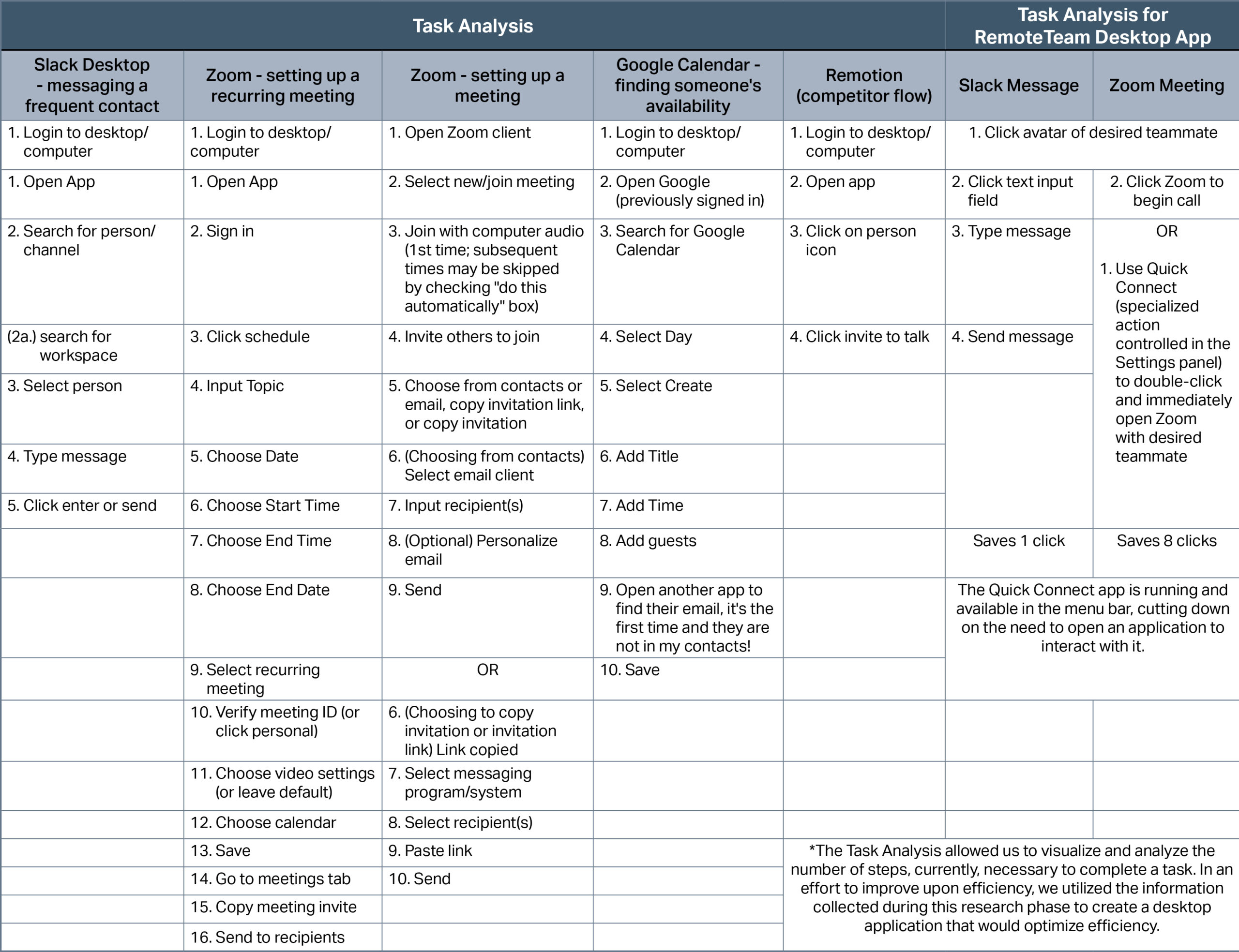
This table shows how some commonly used team communication apps proved very click intensive.
Feature Inventory: My team and I noticed there are TWO types of platforms; those that handle the logistical and HR-related elements of running a business, and those that handle the communication and human interaction aspects of working in tandem with one another.
Since its inception, RemoteTeam has provided a suite of apps for HR professionals to manage teams, distribute global payments, and handle employee time-tracking. Incorporating and fostering coworker connections into this suite of apps would not only make interoffice communications easier, it would also strengthen coworker relationships.
Given the massive number of people currently working from home, finding users to interview was a breeze.
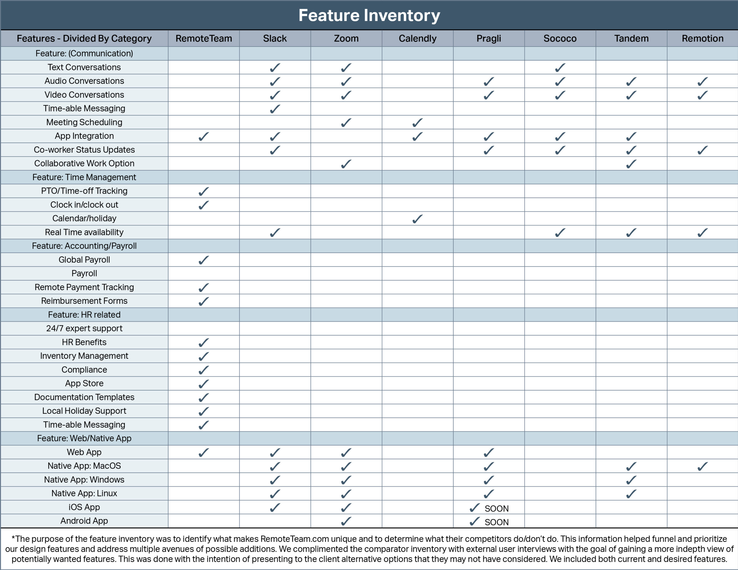
It became apparent this app could be jam-packed. All possible features are shown in this table.
User Interviews: I was the lead for all 15 user interviews which were conducted via Zoom.
My team and I were able to interview the CEO, CTO, UX Lead and Head of Sales for RemoteTeam as well a large group of users very familiar with similar desktop apps. In interview after interview, the importance of interpersonal communication in the workplace became an overarching theme. Due to COVID, inter-office micro-interactions (elevators, break rooms, hallways, “prairie-dogging” over cubicle walls) have completely disappeared. These interactions were key to building and strengthening office culture as well as getting quick answers to questions.
Concept Sketches & Design Studio Sessions: Design inspiration struck on day one so we began sketching early. After a while it felt like we were losing objectivity and sketching very similar ideas over-and-over, so we recruited fellow UX designers to work with us in two design studio sessions.
My team and I presented our colleagues with the challenge, watched them brainstorm ideas, and finally sketch some ideas. We gained some new ideas for the UI of this app while also validating our design direction. The top row of sketches is mine.
You can see that some of the sketches were really complex. This highlighted the fact that we needed to make this app clean and simple while keeping it full-featured for our users.
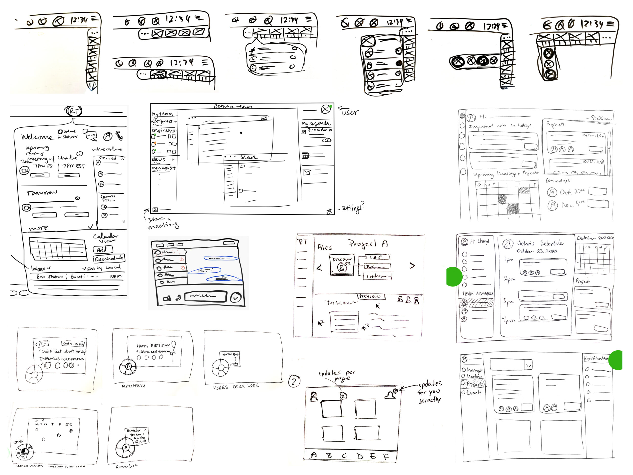
Complex sketches reinforced our focus on simplicity.
User Flows: This app touts a wide variety of features and can be full and robust or simple and streamlined. We came up with a hand full of user flow “happy paths” for some of the more typically accessed features.
Once the user set-up the app it wouldn’t need to be accessed very often but it would always be running in the background. Simplicity with the on-boarding user flow was just as important as the messaging user flow.
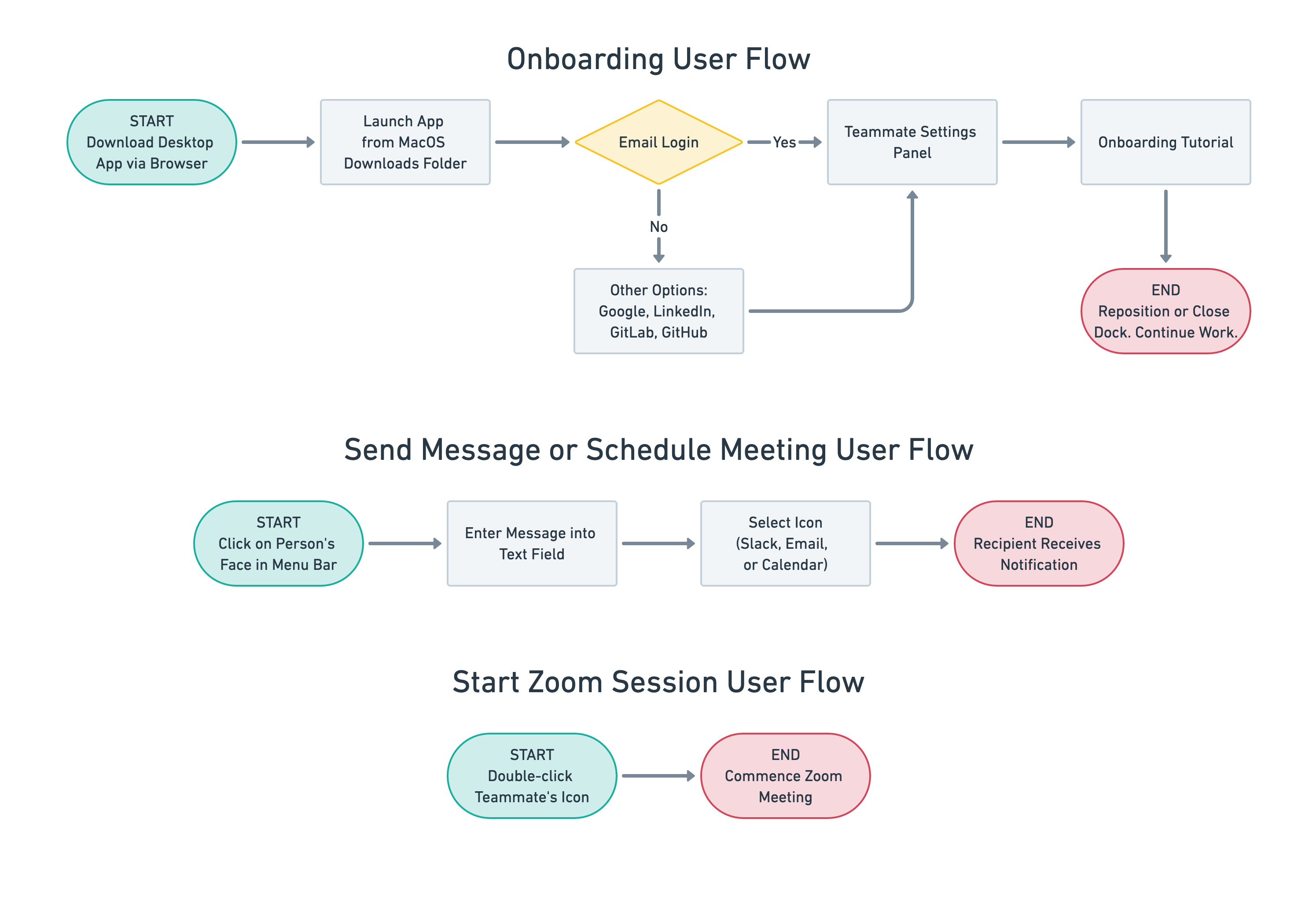
Three key features of the app are highlighted in these user flows.
Insights
This was a unique challenge.
We weren’t redesigning a smartphone app or a website. A ton of research was necessary because we were stepping in to some uncharted territory. Marrying a database/HR app with an app designed to help coworkers stay connected (and doing it well) is somewhat of a new concept. Sure there were many coworker connection apps on the market (Microsoft Teams, Remotion, Slack, and Asana to name but a few) but none that worked well while staying accessible AND out of the way.

User Profile
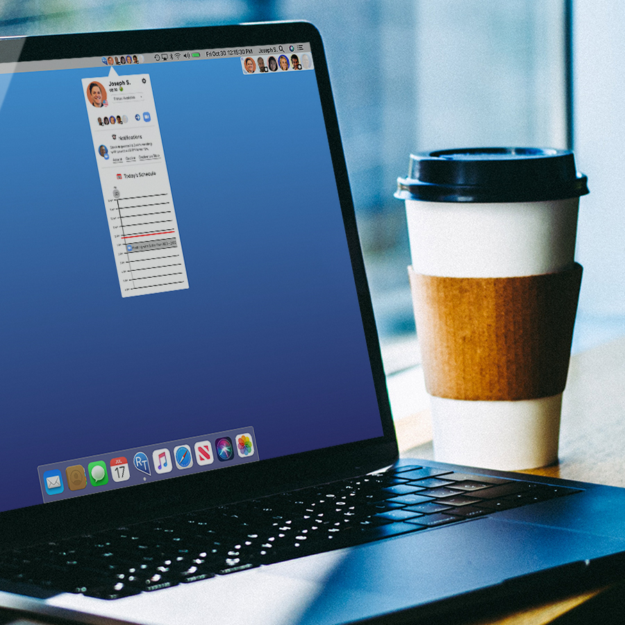
I conducted 15 user interviews (with assistance from my team members) because RemoteTeam’s current UX/UI designer was overburdened and could not collect this type of data. One of the interview subjects was Joseph, RemoteTeam’s head of sales. Not only was Joseph the Head of Sales for RemoteTeam, he also proved to be the ideal user.
Goal and Objectives
- Solving the right problems
- Clear and effective communication
Preferred Communication
- Slack
- Zoom
Gains Information Through
- Brainstorming sessions with the entire company
- Speaking to other teammates frequently
Pain Points
- Doesn't want to disturb coworkers. Would be nice to know when they are available
- Coworkers are international. Would be nice to know their schedule
- Has multiple applications and browser windows open at once. Needs to utilize the limited space he has on his desktop to quickly find people he wants to talk to
Design
Wireframes: Low- to Mid-Fidelity
With such a unique ask from the RemoteTeam CEO, we really didn’t spend a lot of time on wireframes. We had some basic structures of the macOS desktop as well as some general ideas for where this app would reside and its basic functions.
Once we were sure of the basic framework of this app we could expand on its functionality via drop-down/pop-out menus but that didn’t mean we had avoided all potential pain points.
Some early concepts for the menu bar icons and drop-down menus. The menu bar icon status didn’t make sense, and the drop-down menus weren’t optimized for visually impaired users.
Iterating: Status Iconography
Definitely the trickiest aspect of this project. My team and I spent a lot of time discussing and iterating on the best way to show a teammate’s availability. We knew these status indicators would reside in the macOS menu bar and have to fit within the 22-pixel height restriction. That’s not much space for anything complex.
We also had to factor in potential vision impairments (colorblindness), so we ended up using the black/white indicator.
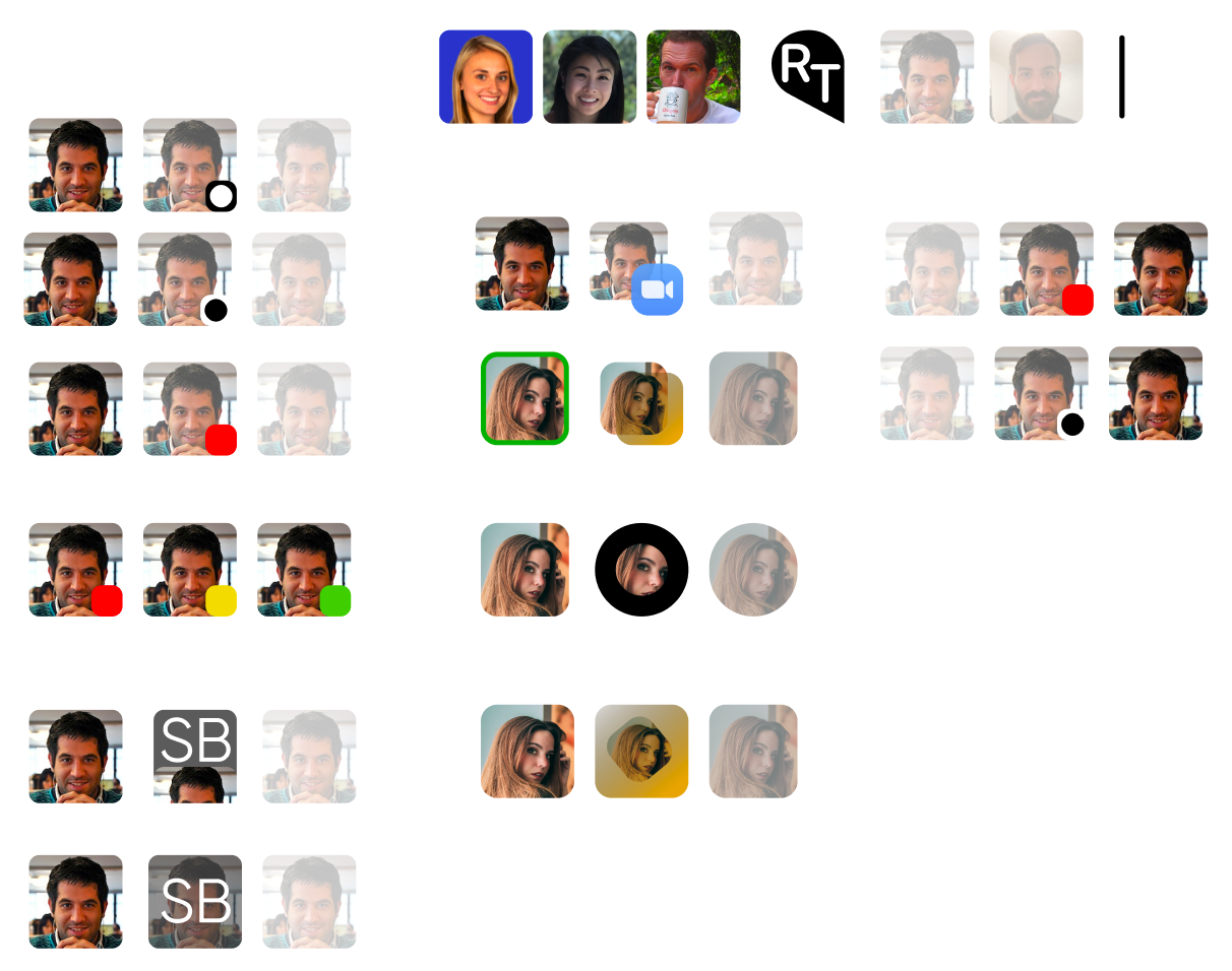
Designing elements to live within the macOS menu bar was a challenge that required a lot of thought, time, and iterations.
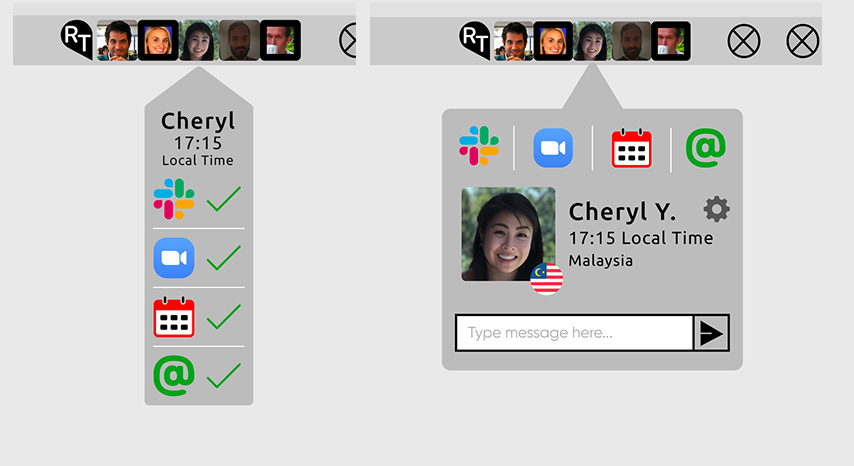
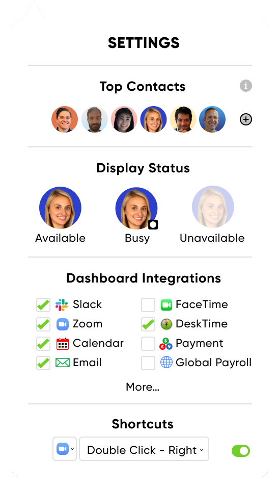
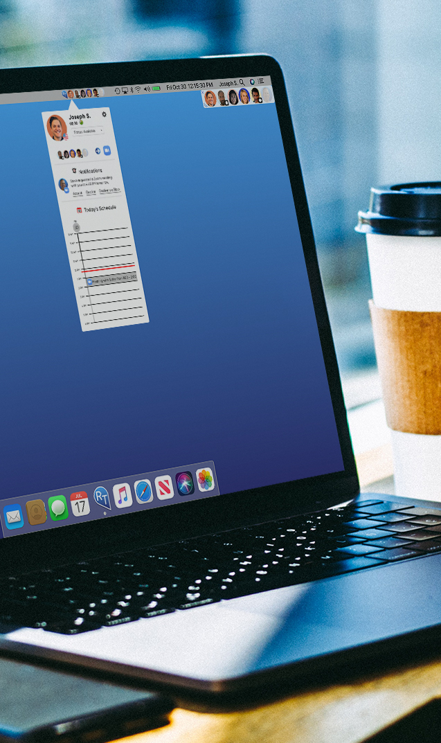
Focal Point: The Settings Drop-down Menu
Many portions of this app contain a lot of information so it was important to keep the layout clean and organized. This drop-down menu contains controls for the most essential features of the app as well as one of the more ground-breaking elements: the QuickConnect feature.
Top Contacts
- The most frequently contacted members of your team are seen here. Add/remove at any time.
Display Status
- Three unique indicators show your teammate’s availability status
Dashboard Integrations
- Select all the app integrations your team uses.
QuickConnect Shortcut
- One of the standout features. For example: setting this to Zoom allows you to start a meeting with a team member with just TWO CLICKS. Most Zoom meetings take a minimum of 10 clicks to initiate.
“Setting the Shortcuts drop-down to ‘Zoom’ allows you to start a meeting with a team member with just TWO CLICKS. Most Zoom meetings take a minimum of 10 clicks to initiate.”
High-Fidelity Prototype
We had a lot of features that didn’t live within the constraints of a smartphone screen or a web browser frame. The prototype was presented in more of an on-boarding/introduction style to make sure we demoed all aspects of this all. Just demonstrating this desktop app to colleagues was an interesting challenge since most of them were more familiar with designing websites and smartphone apps.
As you are clicking/tapping through this prototype please keep in mind this was presented as a “Features Tour” with a lot of explanatory voice overs. Note the small blue blinking areas that will indicate where to click/tap next.
Results & Reflections
A curious project brief led to a unique (and fun) solution that wowed stakeholders
My design team was a well-oiled machine from the get-go. We fell into a great working relationship right away and agreed on all aspects of this project.
I knew my visual design background would come in handy when it came time to develop the UI and the presentation, so I took the lead and established a majority of the UI elements seen throughout the app as well as the final presentation to the client. I also had the opportunity to conduct all 15 user interviews and really honed that skill.
Next steps:
- Quick Connect - brand it as a leading-edge, proprietary feature
- Icebreakers/bonding games (trivia) - get to you your team members as people, not just co-workers who do their jobs
- Remote whiteboarding - share a screen to allows all team members to contribute to the ideation/sketching process
- Voice-activated integration - verbally controlling this app to start a Zoom call or send a Slack message would make it superior to other apps in the same category
This project was very fulfilling and fun! After the presentation and prototype demo, the CEO was thrilled and raved about it over and over. Such a great feeling!