Case Study: Smartphone App
Waste Management
An app to help educate users about recycling options.
My concern for the health of the planet drove my desire to create an app that might educate and inform people about recycling.
Overview
Recycling is absolutely necessary to ensure the health of our planet but proper recycling can be tricky.
A huge variety of product containers makes recycling more and more of a challenge every year for everyone. How can consumers feel confident they are properly recycling used containers? How can manufacturers educate consumers about the materials in their containers? How can recycling facilities properly and thoroughly sort used containers to ensure proper repurposing and recycling?
The Problem
More people need to recycle AND do it correctly.
Billions of people live on this planet. Those billions of people use trillions of different products every year. What happens to those products when the container is empty? Unfortunately, a vast majority of them go into the trash can and end up in landfills.
One of the big problems with recycling is contamination, and, no, that doesn’t mean too many people forget to wash out recyclable containers. “Contaminated Recycling” refers to the problem recycling facilities face when they try to sort, bale, and resell recycled products. The main cause of the contamination is “single-stream recycling,” where all recyclable materials are placed in one container. Combine that with the fact that there is no federal recycling program with uniform rules. All the community recycling programs mentioned above have different requirements adding to the consumer’s confusion.
Recycling became more prominent from 1990-2020.
Now there are over 650 recycling facilities and over 20,000 community recycling programs in the U.S. alone.
Research Methods
Statistics I’ve learned a lot about recycling over the years, but I needed to hunt down actual numbers. Statistics. Ugh, right? Well, with regard to recycling, the numbers are straightforward and do not lie. Consumers are confused. A recent poll discovered 65% of consumers don’t understand what plastics are recyclable. Hmmm, maybe because there are seven different types? And that’s just plastics.
Survey After reading through enough articles to make my eyes cross, I wrote a series of survey questions and sent them to friends, neighbors, and family. I received 36 responses which was fantastic. Guess what? They were just as confused as the folks who took the aforementioned poll.
Conversations I’ve been to countless parties, weddings, and potlucks, and at the end of the event, there is the inevitable conversation about the sorting of recyclables. Aluminum cans and glass bottles are easy. What about hard plastic plates/cups, plastic cutlery, clamshell food containers, bottle caps, straws, and all the different paper products. Yeah, it’s a mess and can be really confusing.

User Persona
Full confession: this user is basically me. Meet “Bernard.”
Goals and Objectives
- Learn more about items being recycled
- Happy items won’t end up in the landfill
- Work toward less waste in public spaces
Preferred Communication
- Smartphone app
Gains Information Through
- Internet Search
- Recycling program promotional mailer
Pain Points
- Confusing/inconsistent recycling rules
- Lack of access to recycling programs
Deliverables
Designing an app from scratch gives you a lot of freedom but can quickly make a project unwieldy. Luckily all the research gave me focus.
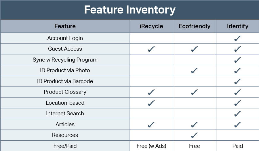
Feature Inventory Somewhat surprisingly there were only two smartphone apps available using the search term “recycle.” Why? Ultra-niche market? Maybe. That said, the two apps that were available had some good features but they needed more. I analyzed all the offerings of both apps and compared them to what I offered in my prototype.
User Surveys I wrote and distributed the survey to a broad base of “average citizens” not knowing if they participated in a city/county-sponsored recycling program or not. 36 responses told me that all but one household had access to curbside recycling. Most were single-stream solutions. An available comment section at the end of the survey indicated that most people were confused about recyclable materials and wanted to do more to improve their participation with their local recycling program.
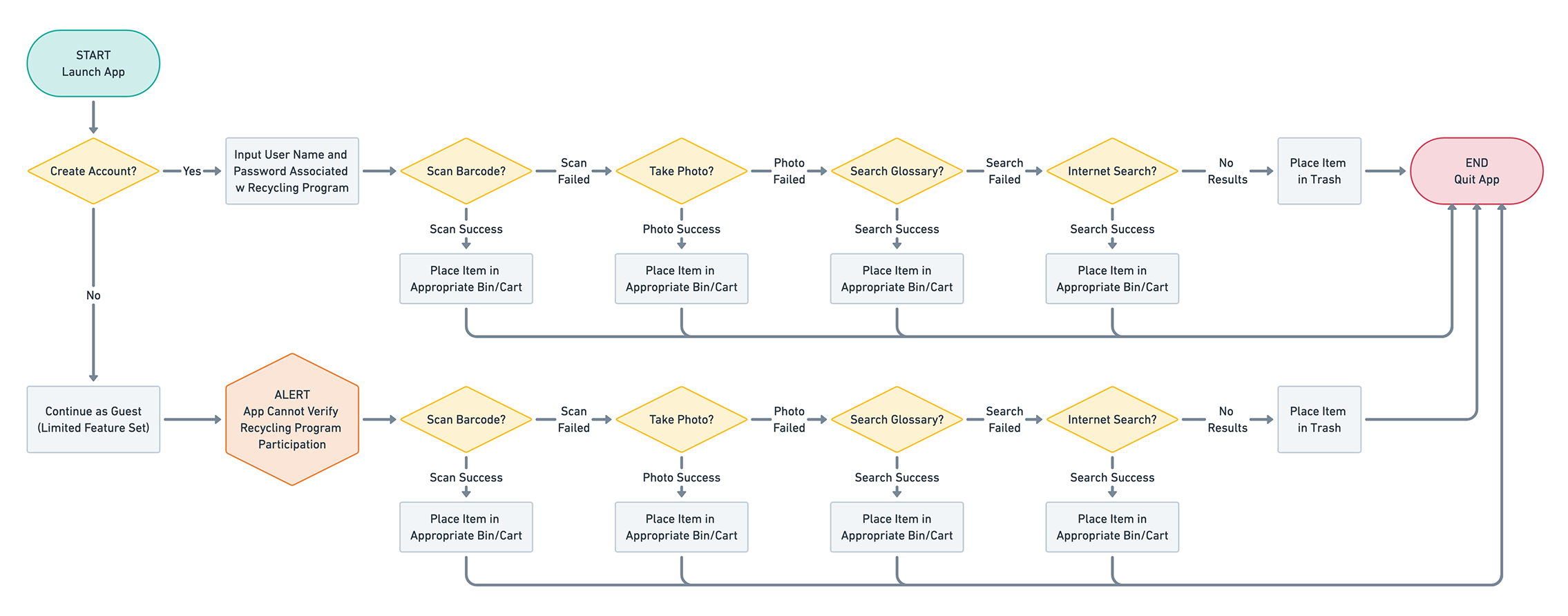
User Flows The purpose of the app was straightforward and allowed account holders and guests alike to access a full range of features.
There are two user flows for Identify: Registered Users and Guests. The only limitation of the guest's access to the app was the ability to confirm if an item was recyclable with the local recycling facility.
Design
This app was not a lifestyle, social media, or gaming app so a clean and simple interface was necessary.
This app is very much a utility app. Not fun. Not sexy. Not hyper-connected to the world. Just an app to find a quick solution and allow the user to get back to their normal routine
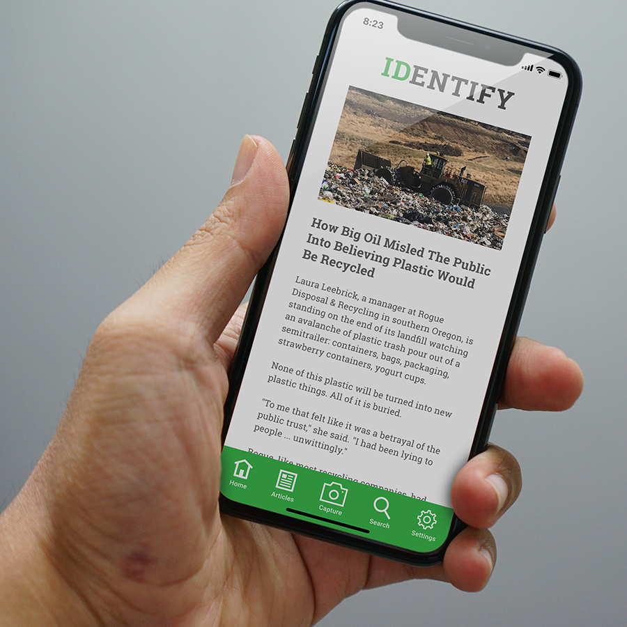
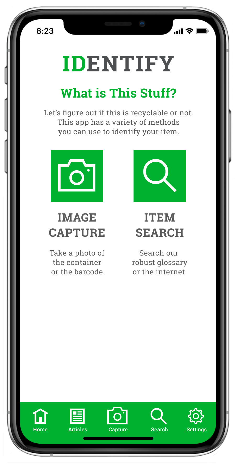
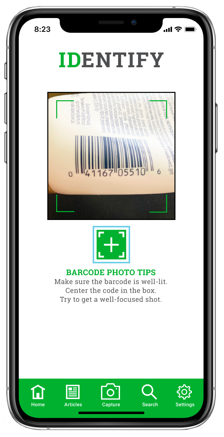
- Capture Image: The essential function of this app. Quick access via home screen or footer dock.
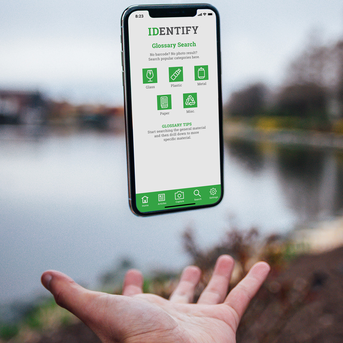
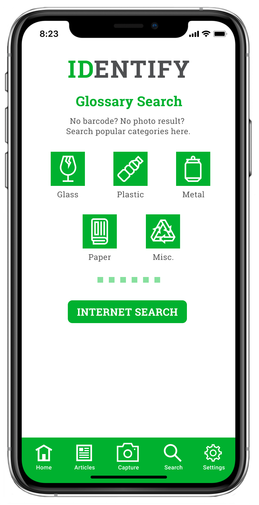
- Glossary Search: Certainly more tedious than an image capture but robust and full-featured to help with quick identification of recyclable items.
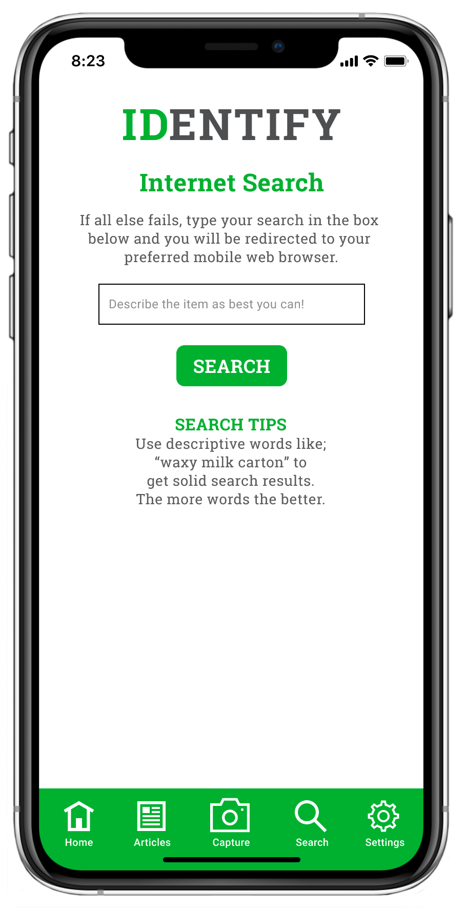
- Internet Search: Last resort option. Users select the search engine of their choice on the Settings screen.
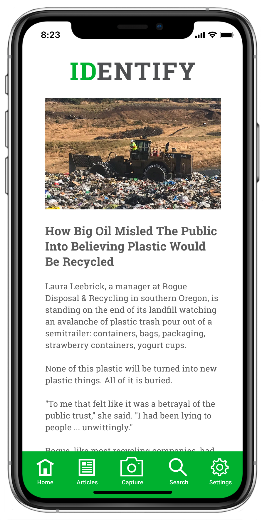
- Articles: A curated selection of articles available with just one tap. Perusing these articles would turn users into full-fledged “recycling geeks.” Hopefully.
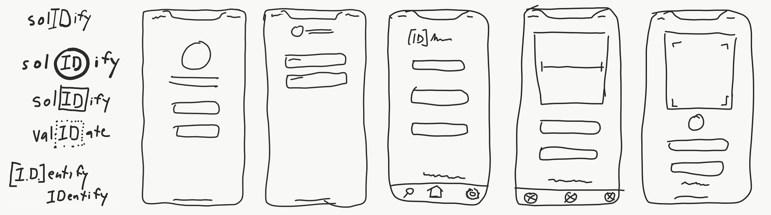
Concept Sketches I had some pretty strong ideas from the beginning of this project and I was certain the app was going to be a “one-trick pony.” The survey responses and research told me otherwise. Recycling can be complicated and confusing and A LOT of people wanted to do more and do it better but they needed an all-in-one resource to assist them. The app obviously needed to be more feature-rich than I originally thought. The sketches were done early on. App iterations were done during wireframing and user testing phases.
Wireframes: With all of the research I performed, I was fairly certain I made all the necessary considerations for every screen this app would require, and I built them all in this wireframe. For me, wireframes came together very quickly and were incredibly straightforward.
Mid-fidelity Prototype: Jumping from wireframes to the prototype stage happened quickly. Once I was sure I had all the appropriate screens to satisfy both user flows, I started fleshing out the screens, with friendly, light-hearted writing. Okay…come on…I’m totally aware that recycling doesn’t rank very high on most people’s lists of…well…anything, so a sense of humor was key. Backing up that sense of humor with polite, clever feedback reinforced the overall “personality” of this app. Prototypes were adjusted continually and quickly went from low- to high-fidelity fairly quickly as you’ll see below.
User Testing: Performing all of my user testing remotely actually allowed me to work quickly in a very streamlined fashion. User survey participants willing to participate in the user testing phase gave me their email addresses at the end of the survey. From that list, I created a Calendly invite with all the information about the testing and allowed participants to choose a date and time that worked with their schedule. Once they selected a date and time they received a confirmation email with the Zoom link and prototype link.
All user testing sessions were done via Zoom with testers accessing a prototype created in Figma. Six testers successfully completed four tasks with a mid-fidelity prototype displaying no color, no images, and real text. Six other testers successfully completed the same four tasks with a high-fidelity prototype.
I was lucky enough to have ample time between tests and made iterations and adjustments to the prototype after almost every test. Glitches were eliminated, confusing elements were finessed, and enhancements were made - improving the user experience every time.
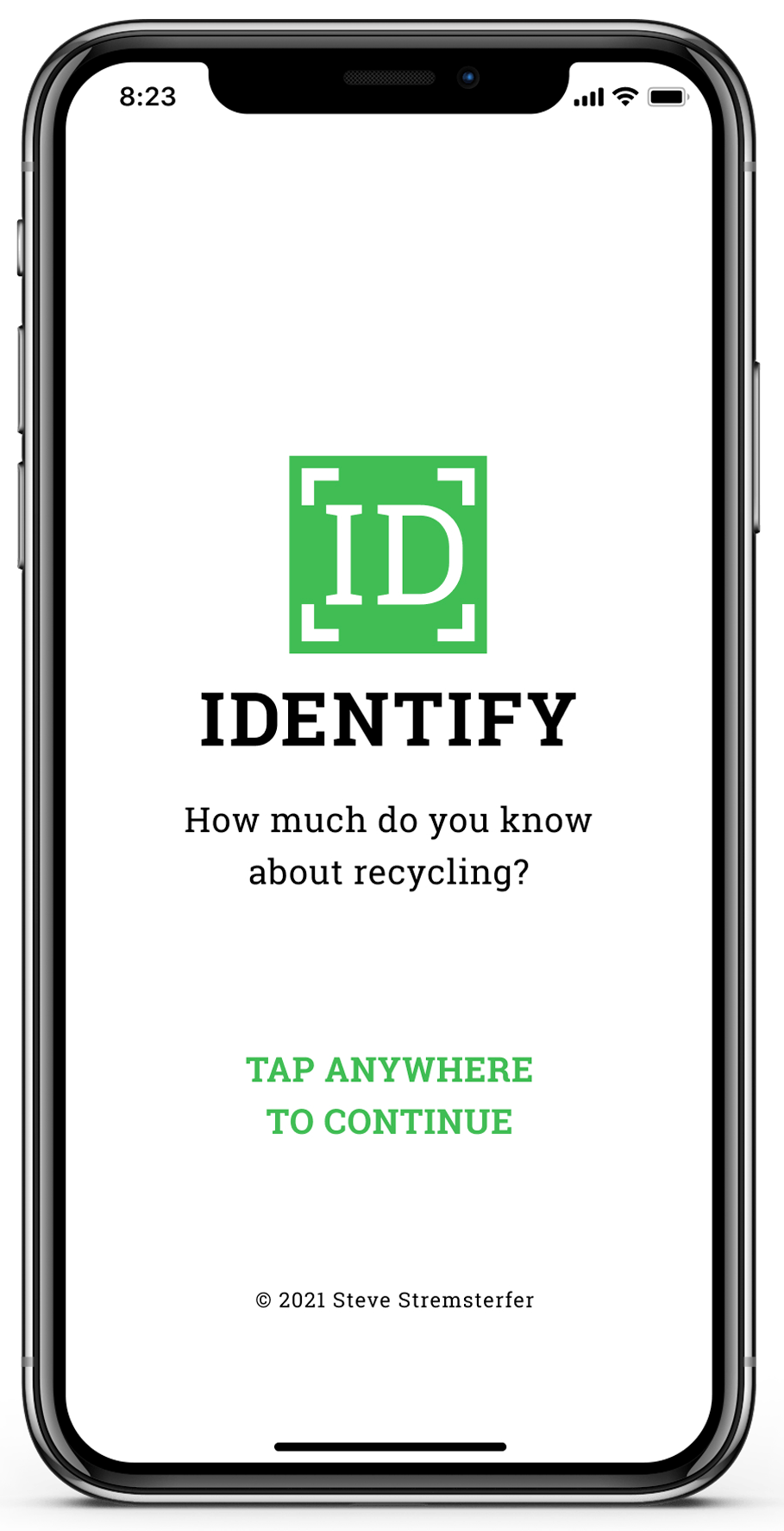
The High-Fidelity Prototype
This app resonated with most users who tested the prototype.
More than half of the users who tested the prototype (whether the mid- or high-fidelity version) made comments like, “This is so cool!” or “I would totally use this app!” I found that to be extremely gratifying as it supported all of my research and design decisions. See what I mean and check out the final prototype with the link below.
The Results
As previously mentioned, I wanted to do this as a solo project to ensure I would be responsible for every single aspect. I didn’t have a specific plan in place other than doing as much research as possible. Once I had the research wrapped up, I let the results guide me.
Almost all of the dozen user testers I talked to loved the concept and execution of this app. Several of them asked me when it would be available to download! Wow!
Yes, most testers loved the app and praised all the features, but the part I found most exciting was making adjustments to the prototype as the testing progressed - quite often making iterations between each test. It was very gratifying to see each tester completing each of the four tasks with greater ease than the previous tester.
The Next Steps
While I’m fairly confident with the features of the app, if it is going to become a reality there is a lot of complicated backend.
- Bar Codes: the bar code scanning feature needs support from manufacturers. One-dimensional (1D) barcodes that you see on all grocery store products, can only contain 10 characters of information which is not enough to indicate the container material. Two-dimensional (2D) barcodes can contain over 100 characters of information but are rarely used for reasons mentioned next.
- Grocery Store Scanners: These devices can only read 1D barcodes. Period. 2D barcodes would be essential to provide ample information to the consumer about what materials make up the container. How do you convince thousands of grocery stores to upgrade their scanners and at what cost for what benefit?
- Recycling Facilities/Programs: 20,000 community recycling programs would need to submit/upload their data regarding recyclable/non-recyclable materials to the app. I have no idea how that works and would need to hire someone experienced with compiling data.
- User Participation: I made contact with a lot of users who were interested in this app but a much larger survey group would be needed to determine the viability of this app. I would need people from big cities, small towns, urban settings, and rural settings to take a survey. Would they like the app? Would they pay for it? Would they be bothered by in-app advertising?
The Reflections
I had strong feelings about developing this app when I was writing my project brief almost two months ago. I thought it would be a great idea but that means nothing if users don’t agree. Thankfully they did. And that validated my concept, ideas, research, testing, wireframing, iterations, and final prototype. It was thrilling to be solely responsible for creating something that quickly and effectively solved a problem for users.